Packaging plays a significant role in marketing and sales. The colors and fonts you choose for your cannabis packaging can attract or deter your ideal customers. Additionally, the texture and quality of packaging can influence purchasing decisions. Understanding how packaging psychology works allows you to select the best solutions for your cannabis products. Keep reading to learn how to choose packaging colors and designs that sell.
The Psychology of Marketing and Packaging
Marketers are experts at understanding what motivates people to buy. They know consumers are more likely to purchase products perceived as high quality, and they use packaging to convey this message. For example, a luxury cannabis company might use sleek, minimalist packaging to convey a message of sophistication and quality. On the other hand, a company targeting a younger generation might use brightly colored packaging to appeal to its audience.
Packaging also plays a vital role in shaping consumers’ perceptions of value. A product that comes in a fancy box is often perceived as more valuable than one that doesn’t. That’s why many cannabis companies are willing to spend extra on packaging even though it doesn’t add any value to the product itself.
Using Packaging Psychology to Build the Perfect Cannabis Product Packages
Five key packaging and design elements influence consumers’ buying decisions: colors, fonts, shapes, textures, and quality. Here is how to choose the best elements for your cannabis product packages.
The Packaging Psychology of Colors
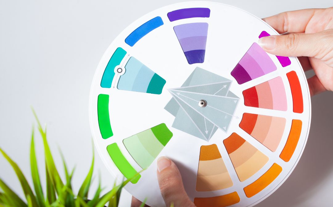
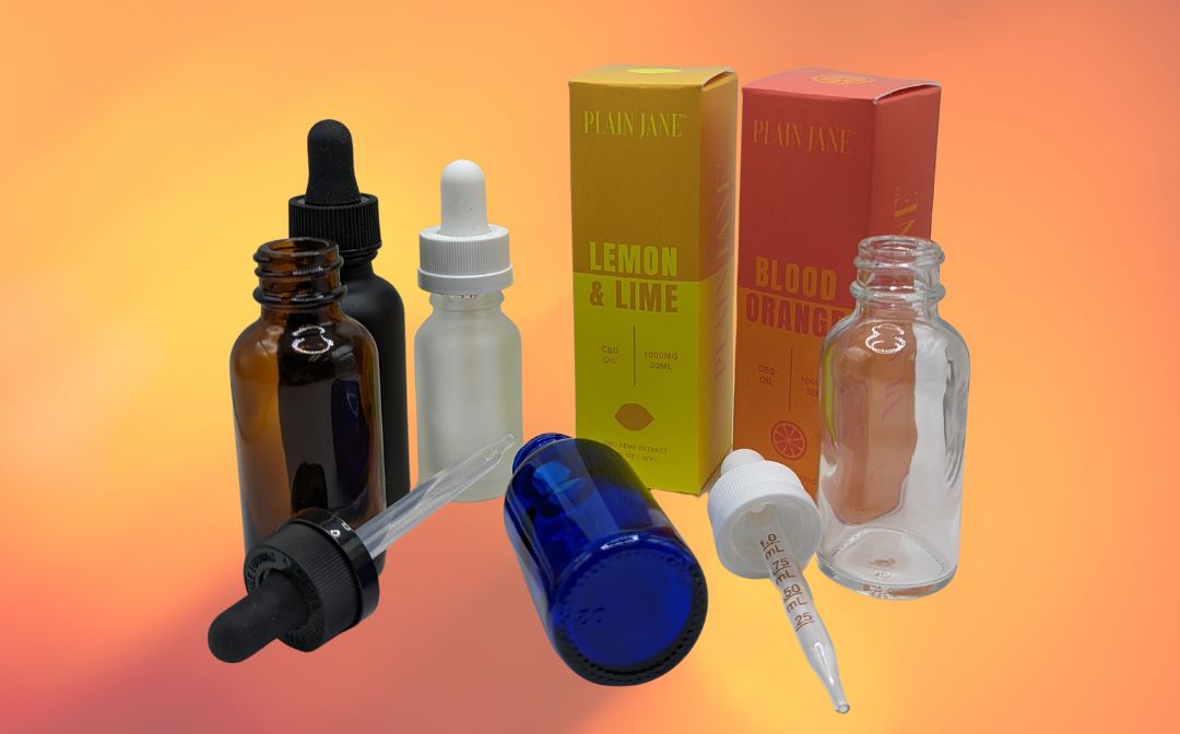
In recent years, there has been a lot of interest in the psychology of colors and how businesses can use certain colors to influence consumer behavior. One area where this is particularly relevant is packaging design. Specific colors can profoundly impact how consumers perceive a product. For example, red is often associated with excitement and energy, while blue is often seen as calming and trustworthy. When it comes to packaging, it is important to consider the visual impact of the colors and the psychological message they send to consumers. As a result, you can choose brand colors to convey specific messages about your cannabis products. Here are some popular colors and what they represent:
- Red: Energy, passion, desire
- Green: Growth, healthy, prosperity
- Blue: Calm, trustworthy, intelligent
- Purple: Royalty, luxury, power
- Yellow: Youthful, energy, optimism
- Orange: Joy, warmth, creativity
- Brown: Security, safety, support
- Black: Mystery, elegance, sophistication
- White: Purity, innocence, integrity
The Packaging Psychology of Fonts
The font you choose for your product packaging can also significantly impact how consumers perceive your brand, as different fonts convey different feelings and messages. For example, a more playful font might be suitable for a casual company, while a sleek and modern font could be better for a high-end brand. People judge a product within milliseconds of seeing it, so the right font can be the difference between making a sale and losing a customer. With so much riding on such a minor decision, selecting the perfect font for your cannabis product packaging is essential.
The Packaging Psychology of Shapes
Have you ever noticed how the shape of a product’s packaging can influence your perception of it? For example, long, thin boxes are often perceived as more luxurious than shorter, squatter ones. This is because long, thin packages convey a sense of sophistication and prestige. On the other hand, shorter, squatter packages tend to be associated with more down-to-earth, everyday products. You can use the packaging psychology of shapes to your advantage when designing packaging for your cannabis products. At Green 420 Pack, we have multiple packaging options in various shapes and sizes to suit your needs!
The Packaging Psychology of Textures
Packaging texture can also influence consumers’ perceptions of your product, quality, and brand. Smooth, shiny surfaces often have a sleek and modern appeal. People associate these materials with luxury and quality and rate such products as more expensive, even when the price tag says otherwise. Rougher, matte textures, on the other hand, tend to look more natural and rustic. People tend to associate such packaging with homely comforts and classic value. So, you can use smooth packaging if you want consumers to perceive your cannabis products as high-end and luxurious. If you want your products to evoke feelings of warmth and familiarity, go for a rougher texture.
The Packaging Psychology of Quality
How often have you been in a store, looking at two similar products, and decided to buy the one with the nicer packaging? Or been given a gift in beautiful wrapping and thought it must be something special? The truth is, we’re all susceptible to the power of packaging psychology. And while it might seem like a frivolous consideration, cannabis companies should take packaging very seriously. After all, first impressions matter. Putting effort into creating attractive, high-quality cannabis packaging pays off, as consumers will assume the product inside is also high-quality.
Choose Packaging Designs that Sell with Green 420 Pack
You want your cannabis products to stand out on the shelves and entice customers to buy. But with so many choices available, how can you make sure your product is the one that gets noticed? Packaging is one of the most critical aspects of selling your product, and choosing a design that appeals to customers is essential.
Green 420 Pack specializes in packaging solutions for the cannabis industry. Our team of experts can help you choose the right packaging design for your product, ensuring it will stand out from the competition. Contact us today to learn more about our cannabis packaging solutions.